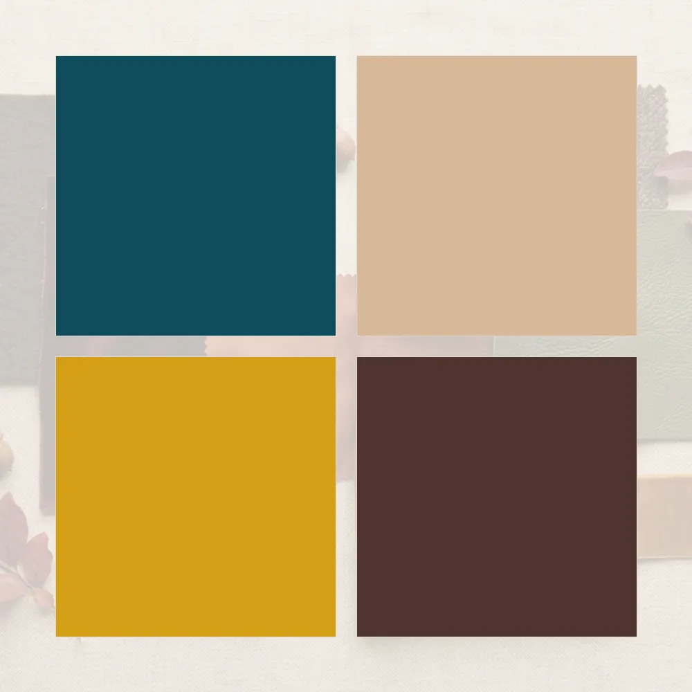
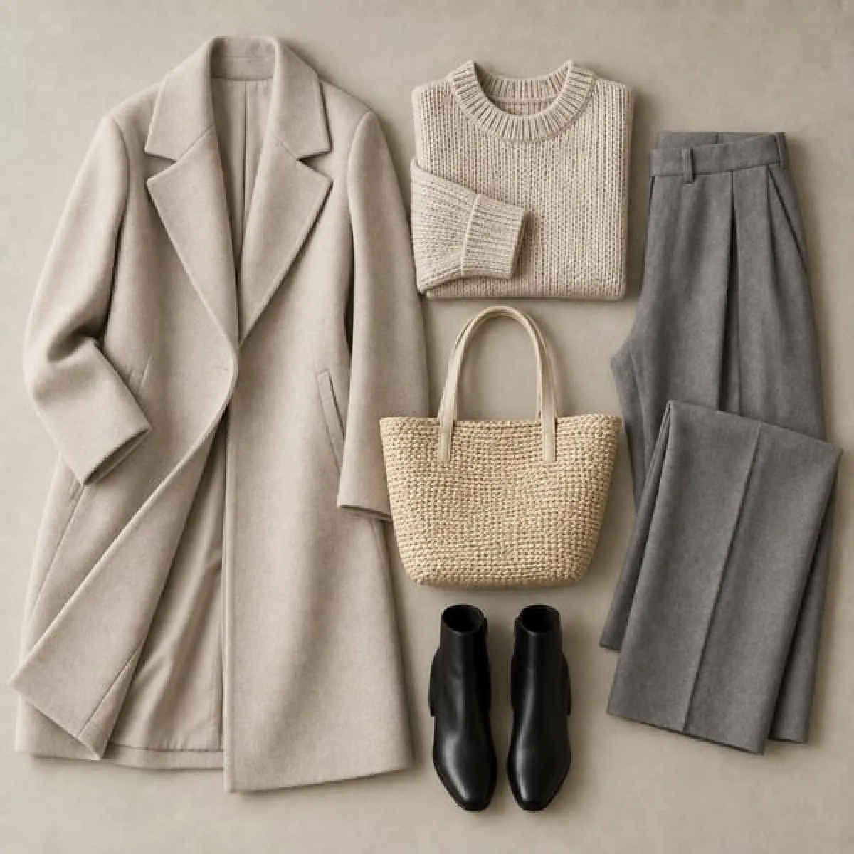
How to Shop With a Colour Palette, In Store and Online

A colour palette is only as good as the shopping it changes. Shopping with a colour palette sounds simple — buy colours from the palette — but in practice shop lighting, fabric sheen and phone screens all distort colour, and a shade that looked right on the rail can look wrong at home.

This guide covers how to carry your palette, how to check colours in store, how to judge colours online, and how to decide on colours that are close but not exact. More in our Colour Analysis section.

Keep your palette on your phone, check colours in daylight near a window rather than under shop lights, hold pieces near your face, and treat online colours as approximate until you see them in person.

Carry Your Palette

You cannot match a colour you cannot see. Save your palette as an image on your phone so it is always with you. The palette generator exports your 24 swatches as a single image sized for a phone, or as hex codes you can paste anywhere.

Do not know your season yet? Start with the colour analysis quiz and read how to take it accurately.

A small physical swatch — a scrap of fabric in your best neutral — is more reliable than a phone screen. Phone brightness and colour settings change how swatches look.

Shopping in Store

Find Daylight

Shop lighting is often warm and flattering, which shifts colours. Take a piece to the window or the door before deciding. Daylight is the light you will be seen in most.

Hold It Near Your Face

For tops, scarves and coats, hold the piece under your chin in the mirror and look at your skin, not the fabric. The right colour makes the skin look even; the wrong one makes you look tired or flushed.

Compare Against Your Palette

Hold the fabric next to your palette image or swatch. You are looking for the same temperature and roughly the same depth, not an exact match.

Shopping Online

Online colour is the hardest to judge. Product photos are edited, lit differently from one item to the next, and viewed on screens with their own colour settings.

  • Look at several photos — the product shot, the model shot and any close-up.
  • Read the colour name — “stone”, “ecru” and “ivory” tell you more about temperature than the photo might.
  • Check reviews — customers often mention when a colour is different in person.
  • Know the returns policy — for a colour you are unsure of, buy where returns are easy.
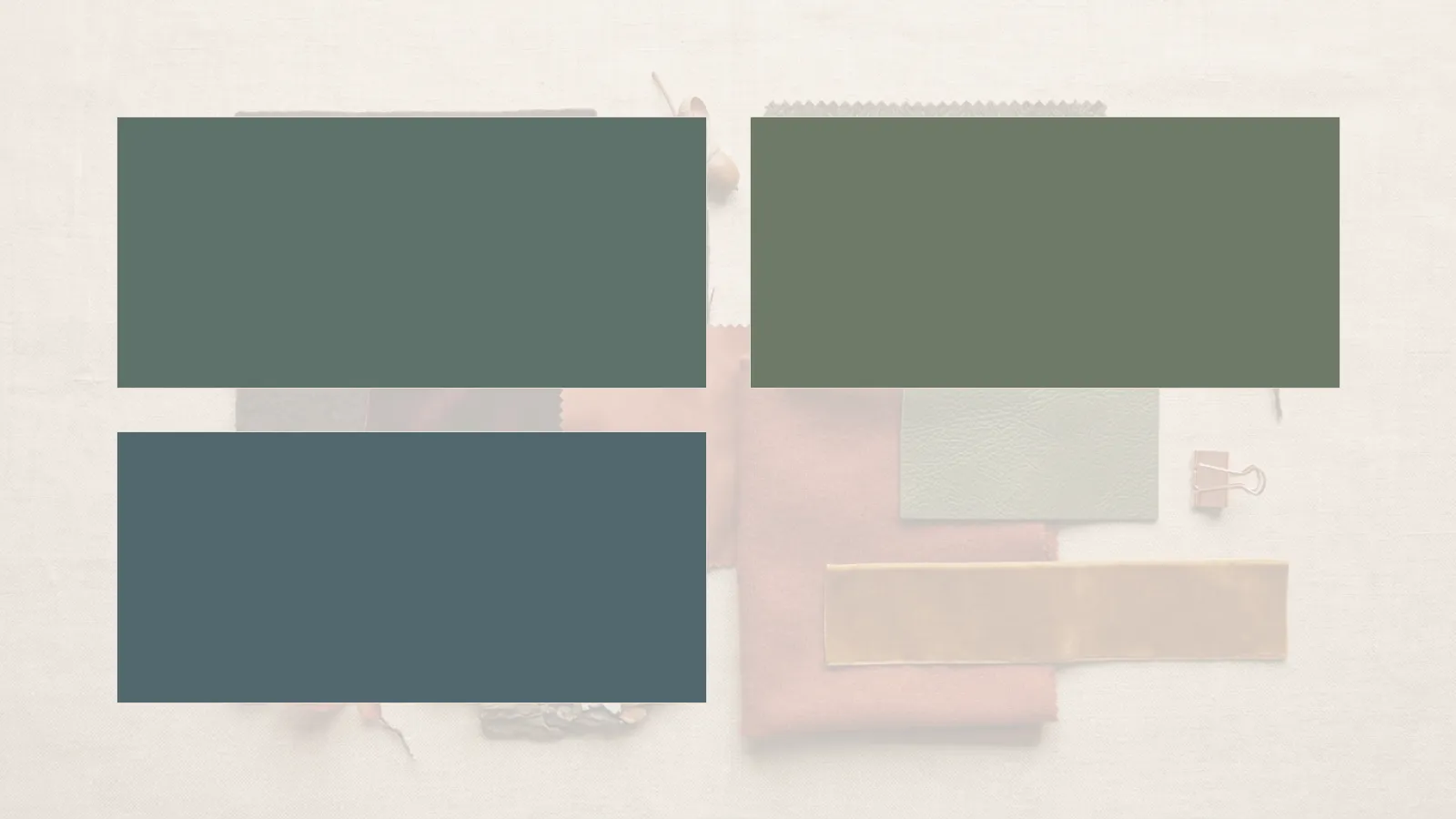
Screens do not show colour accurately. Two phones can display the same product photo quite differently. Treat any online colour as approximate until you see it in daylight. The same rust knit under warm lamplight and in daylight, looking noticeably different.

Fabric Changes Colour

The same dye looks different in different fabrics. Shiny fabrics like satin and silk reflect light and look brighter; matte fabrics like wool and linen look deeper and softer. A colour that is slightly too bright in silk may be perfect in wool. Judge the colour in the fabric you are buying.

When a Colour Is Close but Not Exact

You will rarely find an exact match, and you do not need one. Ask two questions: is the temperature right — warm or cool, matching your palette — and is the depth close? If both are yes, it will work. If the temperature is wrong, it will not, however close the shade looks.

Neutrals are the most important to get right, because they are most of the wardrobe; accents can be more approximate. The best whites and neutrals for each undertone helps with the neutrals, and building a wardrobe from your colour palette explains what to buy first.

A Shopping Checklist

  • Palette saved on your phone, or a fabric swatch in your bag
  • A list of the gaps you are shopping for, by colour
  • Check the colour in daylight before buying
  • Hold tops and scarves near your face
  • Check the temperature matches your palette
  • Consider the fabric’s sheen
  • For online orders, read reviews and check the returns policy

Before buying, check whether a piece earns its price with the cost per wear calculator, and whether it fits your plan with the capsule wardrobe builder. For colour combinations in an outfit, the outfit colour combination generator. For two easy colours to build around, see olive green and brown.

Frequently Asked Questions

How do I shop with my colour palette?

Keep your palette on your phone, check colours in daylight, hold pieces near your face, and match the temperature and depth rather than the exact shade.

Why do clothes look different at home?

Shop lighting is often warm and flattering. Daylight shows the true colour, which is why checking near a window helps.

How can I tell colour online?

Look at several photos, read the colour name and reviews, and buy where returns are easy. Screens are never fully accurate.

Does it need to match my palette exactly?

No. The temperature must match; the depth should be close. The exact shade matters less.

Which colours matter most to get right?

Neutrals, because they make up most of the wardrobe, and anything worn near the face.

For why colours change under different light, see colour temperature and metamerism.
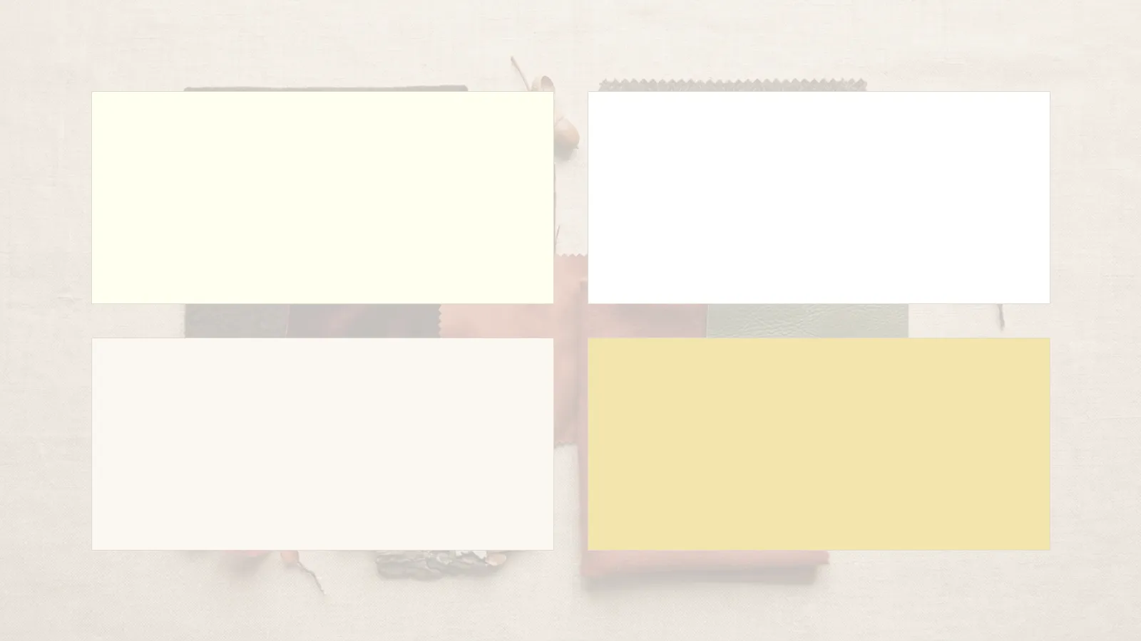
The Best Whites and Neutrals for Each Undertone

Neutrals make up most of a working wardrobe, so getting them right matters more than any single colour. And they are not interchangeable: an optic white, an ivory and a cream look very different next to the face, as do a cool grey and a warm one. Choosing the best whites and neutrals for each undertone is the quickest way to make a whole wardrobe look better without buying anything bright.

This guide covers whites, beiges and browns, greys and dark neutrals for each of the four undertones. More in our Colour Analysis section.

Match the temperature of your neutrals to your undertone: creams, camels and chocolate for warm; pure white, grey and navy for cool; off-white, stone and taupe for neutral; cream, khaki and warm grey for olive.

Everything below depends on your undertone. The test takes two minutes and does not use the vein test.

Why Neutrals Have a Temperature

Every neutral leans slightly warm or cool. An ivory has yellow in it; an optic white has blue. A camel is warm; a taupe sits in between. Next to the face, a neutral with the same temperature as your undertone looks cohesive, and one with the opposite temperature can look very slightly off.

Neutral: a colour with low saturation — white, beige, grey, brown, navy, black — used as the base of a wardrobe. Neutrals still carry a temperature, which is what this guide is about.

Warm Undertones

Creamy whites, golden beiges, camel, warm browns and olive. Pure optic white and blue-greys can look slightly cold next to warm skin. Read more about warm undertones.

SwatchNameHexUse for
Ivory#F6EEDCShirts, knits, tops
Camel#C19A6BCoats, knits
Chocolate Brown#4E342ETrousers, shoes, bags

Cool Undertones

Pure white, soft white, cool greys, navy and charcoal. Creamy yellowish whites and golden beiges can look slightly sallow. Read more about cool undertones.

SwatchNameHexUse for
Soft White#FAFAFAShirts, tops
Cool Grey#8A8D91Knits, trousers
Navy#1F2A44Coats, trousers, dresses

Neutral Undertones

Off-white, stone, taupe, grey-beige and navy — neutrals that are neither strongly warm nor cool. Most neutrals work; the extremes are the only ones to test. Read more about neutral undertones.

SwatchNameHexUse for
Off-White#F2EFE8Shirts, knits
Stone#C8BFB0Trousers, coats
Taupe#8B7D72Knits, bags, shoes

Olive Undertones

Olive skin sits on its own axis, with a green-grey cast that makes some neutrals look richer and others flat. Creams, khaki, olive, warm grey and deep browns tend to work well; stark optic white and some pinky beiges less so. Read more about olive undertones.

SwatchNameHexUse for
Cream#EFE6D2Shirts, tops
Khaki#A39E73Trousers, jackets
Warm Grey#7A746BKnits, coats
Olive undertones are where the standard warm-or-cool advice fails most. If neither creamy nor stark whites have ever looked quite right, olive is worth checking. Four white shirts side by side in ivory, optic white, off-white and cream.

What About Black?

Black is the neutral people ask about most. It sits best with high-contrast colouring — deep and bright winters especially — and can look harsh next to light or soft colouring. If black feels heavy near your face, keep it for trousers, shoes and bags, and use navy, charcoal or chocolate near the face instead.

Neutrals near your face matter most. Your trousers and shoes can be almost any neutral that goes with the rest; your shirt, knit and scarf should suit your undertone.

Putting Neutrals to Work

Neutrals are the base layer of a palette wardrobe — around sixty per cent of it. Building a wardrobe from your colour palette explains the proportions, and the personal colour palette generator gives six neutrals tailored to your season. For metals, see gold or silver for your undertone; for the full picture, the colour analysis quiz and the best colours for your season. Pairing neutrals with colour? See what goes with brown.

Frequently Asked Questions

Which white suits warm undertones?

Ivory, cream and other creamy whites. Pure optic white can look slightly cold next to warm skin.

Which white suits cool undertones?

Pure white and soft cool whites. Yellowish creams can look slightly sallow.

What neutrals suit olive skin?

Cream, khaki, olive, warm grey and deep browns. Stark white and pinky beiges often look flatter.

Does black suit everyone?

Not near the face. It suits high-contrast colouring best; otherwise navy, charcoal or chocolate can replace it near the face.

Do neutrals matter if I wear colour?

Yes. Neutrals make up most of a wardrobe and are the colours worn closest to the face most often.

For background, see human skin colour and the Munsell colour system, which describes how colours differ in hue, value and chroma.

How to Take a Colour Analysis Quiz and Get an Accurate Result

A colour analysis quiz can only be as accurate as the answers it gets, and most inaccurate results come from the same few mistakes: answering under warm indoor light, answering about dyed hair rather than natural colouring, or answering about the colours you like rather than the ones that suit you. Learning how to take a colour analysis quiz properly takes five minutes of preparation and makes the result far more reliable.

This guide covers how to set up, how to answer each kind of question, what to do if the result feels wrong, and where a quiz stops being useful. More in our Colour Analysis section.

Take the quiz in natural daylight, with no makeup and your natural hair colour in mind, and answer about what you see rather than what you like. If the result sits between two seasons, read both. Seasonal colour analysis is a styling convention, not a scientific system, and there is no peer-reviewed evidence behind it. A quiz is a useful way to narrow a palette, and it works best treated as a starting point rather than a verdict.

Before You Start

  • Sit near a window in natural daylight, not under indoor bulbs
  • Remove makeup, or at least foundation and blush
  • Pull your hair back if it is dyed, so you can think about your natural colour
  • Wear a white or grey top so no strong colour reflects onto your face
  • Have a mirror to hand
  • If you have them, gather a gold and a silver piece of jewellery
Warm indoor lighting makes almost everyone look warmer than they are, and can push a cool-toned person into a warm season. Daylight on an overcast day is the most reliable light for colour analysis.

How to Answer Each Kind of Question

Questions About Your Skin

Answer about your skin without a tan, and without makeup. If you tan easily, think about how your skin looks in winter.

Questions About Your Hair

Answer about your natural colour — the colour at the roots, or your colour before you started dyeing it. Dyed hair describes a choice, not your colouring.

Questions About Your Eyes

Look in daylight and notice the overall impression — clear and bright, or soft and blended — as well as the colour itself.

Questions About How Colours Look on You

Answer about what happens to your face, not whether you like the colour. A colour suits you if your skin looks even and your eyes look clear; it does not suit you if you look tired, grey or flushed.

For any question about how a colour looks on you, hold the item under your chin and look at your skin, not at the fabric. The colour you love and the colour that suits you are often different. Line drawing of a table by a window in daylight holding a mirror, a white cloth and two pieces of jewellery.

Take the Quiz

Twelve questions, weighted scoring, and a result in one of twelve seasons. No email, and no photo.

If you are not sure whether you are warm or cool, start with the undertone test — it is the foundation the quiz builds on.

If the Result Feels Wrong

First check the conditions: was the light warm, were you wearing makeup, did you answer about dyed hair? Retake it in daylight if any of those applied.

Second, look at the neighbouring seasons. Many people sit near the boundary between two, and the quiz result page names the closest alternative. Read both descriptions and try colours from each — the shared colours are safe, and the difference shows at the edges. The best colours for your season shows all twelve side by side.

A photo analysed by an app or an AI chatbot gives a more accurate result than a quiz. Photos distort colour. Camera white balance, screen settings and lighting all change skin tone in an image, which is why photo-based results often disagree with each other. A daylight quiz or an in-person draping is more reliable.

When a Professional Is Worth It

An in-person colour analysis uses physical fabric drapes under controlled light and a trained eye, and it is meaningfully more accurate than any quiz. It is worth considering if you are about to rebuild a wardrobe, if quizzes keep giving you different results, or if you simply want certainty. A quiz is the free first step; a draping is the precise one.

After You Have Your Season

Turn the season into a working palette with the personal colour palette generator, then read building a wardrobe from your colour palette and how to shop with a colour palette. For an example of one full season, see the Deep Autumn palette explained. For neutrals and metals, the best whites and neutrals for each undertone and gold or silver for your undertone. Changed your hair recently? Hair colour by colour season explains how it shifts things.

Frequently Asked Questions

How do I take a colour analysis quiz accurately?

In natural daylight, without makeup, thinking about your natural hair colour, and answering about what you see rather than what you like.

Should I answer about my dyed hair?

No. Answer about your natural colour — at the roots, or before you started dyeing it.

Why did I get a different season from another quiz?

Different quizzes weight questions differently, and lighting and makeup change answers. Many people sit near a boundary between two seasons.

Is a photo analysis more accurate?

Usually not. Cameras and screens distort colour, which is why photo results often disagree.

Is colour analysis scientific?

No. It is a styling convention with no peer-reviewed evidence behind it, useful as a way to narrow a palette.

For the history of the approach, see colour analysis, and on how cameras change colour, colour balance.

Hair Colour by Colour Season: Choosing Shades That Work

Hair is one of the three inputs to colour analysis, alongside skin and eyes, so it works both ways: your season suggests which hair colours will look natural on you, and changing your hair colour can change which clothing colours suit you. Choosing hair colour by colour season means working with your undertone rather than against it.

This guide covers the principles for each season family, what to consider when going grey, and what to do after a change. It is a styling guide, not a substitute for a colourist who can see your hair and skin. More in our Colour Analysis section.

Match your hair colour’s temperature to your undertone — golden and copper tones for warm seasons, ash and cool tones for cool seasons — and its depth to your natural contrast. After a big change, retake the colour quiz. Seasonal colour analysis is a styling convention, not a scientific system, and there is no peer-reviewed evidence behind it. It is useful as a way of narrowing choices, and a good colourist will always look at your actual hair and skin.

The Two Principles

Temperature

Warm undertones tend to suit hair colours with golden, copper or red tones. Cool undertones tend to suit ash, cool brown, platinum and blue-black tones. The undertone test tells you which you are.

Contrast

Some people have high natural contrast between hair, skin and eyes; others low. Bright and deep seasons usually suit clearer, higher-contrast hair colours; light and soft seasons usually suit softer, blended ones.

Hair Colour for Each Season Family

Spring — Warm and Light

Golden blondes, strawberry blonde, honey, light warm browns and soft copper. Avoid very ashy or very dark shades, which can look heavy against light, warm colouring.

Summer — Cool and Soft

Ash blonde, cool light and mid browns, soft mushroom tones. Blended, low-contrast shades work best; very warm golden or brassy tones less so.

Autumn — Warm and Rich

Copper, auburn, chestnut, warm mid to dark browns and golden brown. Deep Autumns can carry rich dark browns; Soft Autumns suit softer, blended warm shades.

Winter — Cool and Clear

Cool dark brown, espresso, blue-black and, for some, icy platinum. Clear, high-contrast shades suit most winters; warm golden tones less so.

Season familyTemperatureHair colours that tend to work
SpringWarm, lightGolden blonde, strawberry, honey, light copper
SummerCool, softAsh blonde, cool light and mid browns
AutumnWarm, richCopper, auburn, chestnut, warm browns
WinterCool, clearCool dark brown, espresso, blue-black, platinum
Four hair colour swatches: golden honey blonde, ash light brown, copper auburn and cool espresso.

The twelve seasons go further than four families. The best colours for your season shows each one, and the full Deep Autumn palette is an example of how detailed a single season gets.

Going Grey

Grey and silver hair are cool in tone, which can shift which colours suit you. Many people find cooler, clearer clothing colours start to work better as they go grey, and that warm golden tones near the face need rethinking. Others blend grey with highlights or lowlights in their natural temperature.

Neither is right or wrong. What matters is noticing whether familiar colours still look right, and adjusting if not.

If colours that used to suit you now look slightly off after a hair change or going grey, retake the colour analysis quiz. Your season may have shifted towards a neighbouring one.

After a Big Change

A move from dark to light, or warm to cool, can change your season. After a significant change, check which of your clothes still work — neutrals near the face are the first to show it — and update your palette with the personal colour palette generator. Building a wardrobe from your colour palette covers what to do next.

The same logic applies to metals and makeup: see gold or silver for your undertone and the best whites and neutrals for each undertone. For the cut rather than the colour, read haircuts by face shape. And for how style questions differ from colour ones, capsule wardrobes over 40 covers how colouring can shift over time.

Frequently Asked Questions

What hair colour suits my colour season?

Match the temperature to your undertone and the depth to your natural contrast — golden and copper for warm seasons, ash and cool tones for cool seasons.

Can changing my hair colour change my season?

It can shift which clothing colours work best. After a big change, retake the colour analysis quiz.

What hair colour suits cool undertones?

Ash blonde, cool browns, espresso, blue-black and, for some, platinum.

What hair colour suits warm undertones?

Golden blonde, honey, copper, auburn, chestnut and warm browns.

Does grey hair change what colours suit me?

Often, since grey is cool in tone. Many people find cooler, clearer colours start to work better near the face.

For background, see human hair colour and the history of colour analysis.

Building a Wardrobe From Your Colour Palette, Step by Step

A colour palette is only useful once it changes what you buy. Building a wardrobe from your colour palette means deciding which of your colours carry the wardrobe, which add variety, and which are used sparingly — and then buying in that order. Done well, it is the single change that makes a small wardrobe produce the most outfits.

This guide covers how to structure a palette, the proportions that work, and a step-by-step way to build or rebuild a wardrobe around it. More in our Colour Analysis section.

Build the wardrobe in three layers: neutrals for most of it, main colours for variety, accents in small doses. Buy the neutrals first, and every later piece will work with what you already own.

Start With Your Palette

If you do not have one yet, start with your colour season, then turn it into a working palette. The palette generator gives 24 swatches split into neutrals, main colours, accents and metals — exactly the structure this guide uses.

Do not know your season? Take the colour analysis quiz first, or start with the undertone test. The best colours for your season shows all twelve palettes side by side.

The Three Layers of a Palette Wardrobe

Neutrals — Most of the Wardrobe

Two or three neutrals from your palette form the base: coats, trousers, most knits, shoes and bags. Because they all work together, they make repetition invisible. See the best whites and neutrals for each undertone.

Main Colours — Variety

Three or four main colours for tops, knits, dresses and a skirt. These are what make outfits feel different from day to day.

Accents — Small Doses

One or two accent colours for a scarf, a bag, a shoe or jewellery. Accents give an outfit its point of interest.

LayerShare of wardrobeUsed for
NeutralsAbout 60%Coats, trousers, most knits, shoes, bags
Main coloursAbout 30%Tops, knits, dresses, a skirt
AccentsAbout 10%Scarves, bags, jewellery, one statement piece
The 60/30/10 rule: a guide to colour proportion borrowed from interior design — roughly 60% dominant colour, 30% secondary, 10% accent. In a wardrobe it becomes neutrals, main colours and accents. A garment rail with a random mix of unrelated colours. The same rail with a coherent palette of camel, cream, navy, grey, rust and olive.

Step by Step

  1. Audit. Lay out what you own and sort it into palette neutrals, palette colours, and pieces outside the palette.
  2. Keep what works. Pieces in your palette stay. Pieces outside it that you love and wear stay too — the palette is a guide, not a purge.
  3. Fill the neutral gaps first. A coat, trousers and shoes in your neutrals make everything else wearable.
  4. Add main colours. Two or three tops and knits, then a dress.
  5. Add accents last. A scarf and a bag do the most for the least money.
Do not throw away everything outside your palette. Pieces you wear and love are working. Use the palette to guide what you buy next, not to empty your wardrobe. Colours near your face matter most. A coat, a scarf and a top should come from your palette; trousers and shoes are further away and can be any neutral that works with the rest.

Making Colours Work Together

A palette tells you which colours suit you; it does not tell you which combinations work in an outfit. The outfit colour combination generator does, and it can filter its combinations by your season.

For two colours that are easy to build around, see what goes with olive green and what goes with brown. When you are out shopping, how to shop with a colour palette covers the practical side.

From Palette to Capsule

A palette and a capsule wardrobe work best together: the palette decides the colours, the capsule decides the number and type of pieces. The capsule wardrobe builder puts your palette across the top of its checklist. For the pieces themselves, see the ten pieces European wardrobes are built on and the year-round capsule wardrobe checklist.

Frequently Asked Questions

How do I build a wardrobe from my colour palette?

Use neutrals for most of the wardrobe, main colours for variety and accents in small doses. Buy the neutrals first so every later piece works with them.

How many colours should a wardrobe have?

Two or three neutrals, three or four main colours and one or two accents is enough for a wardrobe where almost everything combines.

Should I get rid of clothes outside my palette?

No. Keep what you love and wear. Use the palette to guide future purchases.

What is the 60/30/10 rule for clothes?

Roughly 60% neutrals, 30% main colours and 10% accents — a proportion that keeps a wardrobe cohesive while leaving room for variety.

Which pieces should be in my palette colours?

Those worn closest to the face — tops, scarves, coats. Trousers and shoes can be any neutral that works with the rest.

For the colour theory behind palettes, see the Munsell colour system, and for the history of the seasonal approach, colour analysis.

Gold or Silver? Which Suits Your Undertone, and When It Does Not Matter

The advice is repeated so often it has become a rule: warm skin wears gold, cool skin wears silver. It is a reasonable starting point for choosing gold or silver jewellery by undertone, and it explains most of what people notice when they hold the two metals against their skin. It also leaves out olive undertones entirely, says little about neutral skin, and implies there is a wrong answer — which there usually is not.

This guide sets out how undertone affects the choice between gold and silver, where the rule holds, and where your own preference is the better guide. More guides are in our Colour Analysis section.

Warm undertones usually suit gold and cool undertones silver. Neutral undertones suit both, and olive undertones often suit both too — with antique and brushed finishes working particularly well.

Everything below depends on your undertone. The test takes two minutes, uses seven weighted questions and does not rely on the vein test.

Why Undertone Affects Metal

Undertone is the colour beneath the surface of the skin. It stays the same when a tan comes and goes, which is why it is a more useful guide than surface colour. Yellow gold carries warm, yellow tones; silver carries cool, grey-blue ones.

Against skin with a matching undertone, each metal looks cohesive — the skin and the metal seem to belong together. Against the opposite undertone, the metal can look very slightly separate from the skin around it. The effect is subtle, strongest close to the face, and weakest on the hands.

Undertone: the colour beneath the surface of the skin — warm, cool, neutral or olive. It does not change with a tan, which is why colour analysis and metal choice are built on it rather than on skin depth.

Gold or Silver for Each Undertone

Warm Undertones

Yellow gold, rose gold, brass and bronze tones all sit naturally against warm skin. Silver is not wrong, but it can look slightly cooler than the skin around it, especially in high-polish finishes. Read more about warm undertones.

Cool Undertones

Silver, platinum and white gold. Yellow gold can read as slightly separate from cool skin, though a pale or brushed gold narrows the gap considerably. Read more about cool undertones.

Neutral Undertones

Both metals, which is the advantage. Mixing metals works naturally, and the choice comes down entirely to preference and to the rest of the outfit. Read more about neutral undertones.

Olive Undertones

Olive skin sits on a different axis from warm and cool, which is why the standard rule so often gives olive readers a confusing answer. Both metals can work. Antique gold, brushed finishes and oxidised silver tend to work better than high-polish versions of either. Read more about olive undertones.

Olive undertones are the ones the usual gold-or-silver rule fails most often. If the standard advice has never quite fitted you, olive is worth checking.
UndertoneUsually suitsAlso worksFinish to try
WarmYellow gold, rose goldBrass, bronzeHigh polish
CoolSilver, platinum, white goldPale goldHigh polish
NeutralBothMixed metalsAny
OliveBothAntique gold, oxidised silverBrushed or antique
Four groups of jewellery on linen: polished gold, polished silver, mixed gold and silver, and brushed antique gold beside oxidised silver.

The Jewellery Comparison, Done Properly

Holding gold and silver near your face is one of the quickest undertone checks, and it works best done carefully.

  1. Stand in natural daylight, not under warm indoor bulbs.
  2. Remove makeup at the jawline, or test before applying it.
  3. Hold a gold piece beneath your chin, then a silver one.
  4. Ask which one makes your skin look even, rather than which metal looks nicer on its own.
Hold the pieces near your face, not on your hand. The effect of undertone on metal is much stronger at the jaw and neck than on the wrist.

This is a useful quick check but not a decisive one on its own. The undertone test combines several checks for that reason, and excludes the vein test entirely.

Looking at the colour of the veins on your wrist tells you your undertone. The vein test is unreliable, particularly on deep and olive skin, where it often gives the wrong answer or none at all. A combination of checks is far more accurate.

When It Does Not Matter

Preference overrides the rule. Someone who loves silver and has warm skin should wear silver; the difference is subtle, and liking what you wear matters far more. Jewellery worn on the hands, pieces with coloured stones, and large statement pieces are all affected less by undertone than fine chains and earrings near the face.

Mixing metals has also become entirely normal. A single piece that combines both — a two-tone ring, a watch with gold and steel — holds a mixed look together and removes the question altogether.

Beyond Jewellery

The same undertone logic runs through clothing colour. The neutrals that sit closest to your face, the white of a shirt, the shade of a coat — all of them follow the same warm-cool pattern. Your undertone is the first step; your full colour season goes further.

Read the best whites and neutrals for each undertone next, then the best colours for your season. The personal colour palette generator includes metals in its 24 swatches. When you are ready to buy, see European jewellery brands worth knowing, earrings by face shape, and for rings, the ring size converter. Changed your hair colour recently? Hair colour by colour season explains how it affects the picture.

Frequently Asked Questions

Does gold or silver suit me?

Warm undertones usually suit gold and cool undertones silver. Neutral and olive undertones often suit both. The undertone test gives a quick answer.

What jewellery suits olive skin?

Both metals can work. Antique gold, brushed finishes and oxidised silver often work better than high-polish versions.

Can I mix gold and silver?

Yes. Mixing metals is entirely normal, and a piece that combines both — a ring or watch — helps tie a mixed look together.

Does the vein test tell you which metal to wear?

It is unreliable, particularly on deep and olive skin, and this site does not use it. A combination of checks is more accurate.

Does rose gold suit cool undertones?

Rose gold leans warm, but softer rose golds can work on cool and neutral skin. Try it near the face in daylight.

For background on how skin colour and undertone vary, see human skin colour, and on the metals themselves, coloured gold.

The Deep Autumn Colour Palette, Explained

The deep autumn colour palette is one of the richest of the twelve seasons: warm, saturated, grounded colours with real depth — rust, olive, burgundy, chocolate, teal. It suits people whose colouring is both warm and dark, and it is one of the easiest palettes to build a wardrobe around because so many of its colours act as neutrals.

This guide covers what deep autumn is, how to tell if you are one, the full palette with hex codes, the neutrals, the colours to avoid, and how it differs from its neighbours. More in our Colour Analysis section.

Seasonal colour analysis is a styling convention, not a scientific system, and there is no peer-reviewed evidence behind it. It is a useful way to narrow a palette, and this site treats it that way.

What Is Deep Autumn?

Deep autumn is a seasonal colour palette characterised by warm undertones, depth and richness. The colours are warm, saturated and grounded, with an earthy quality — think warm browns, deep greens, rich reds and golden tones. Compared with soft autumn, the colours are deeper and more vibrant; compared with true autumn, they are darker and more intense.

It sits at the boundary between autumn and winter: it takes autumn’s warmth and adds some of winter’s depth and contrast.

How to Tell If You Are a Deep Autumn

Deep autumns typically have warm undertones with depth and contrast. The colouring often shows up as warm, golden or olive undertones in the skin, with darker hair and eyes. You usually look best in rich, warm, deep colours rather than light or cool ones.

You are likely a deep autumn if you have warm undertones, darker hair and eyes, and you look best in rich, warm, deep colours like olive, rust, burgundy and warm brown.

Key Characteristics

  • Warm undertones — golden, olive or warm beige
  • Darker hair — dark brown, warm black or dark auburn
  • Darker eyes — brown, hazel or deep green
  • You look best in warm, rich, deep colours
  • You may look washed out in cool, icy or pastel tones

The surest way to check is the quiz, which places you in one of the twelve seasons in about three minutes.

The Complete Deep Autumn Colour Palette

These are the key colours for deep autumns, with hex codes for easy reference. They are warm, rich and deep, and work together.

SwatchNameHexWhere it works
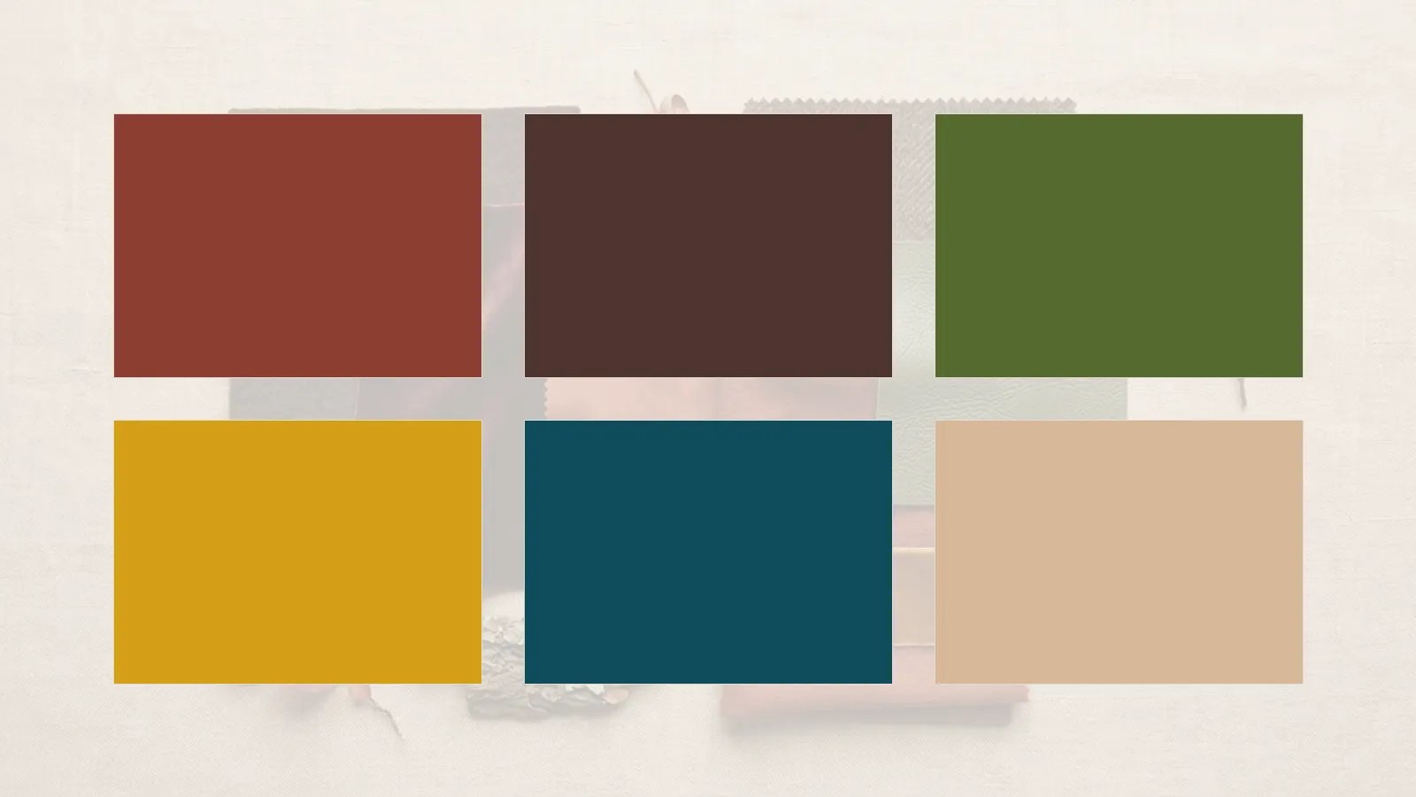
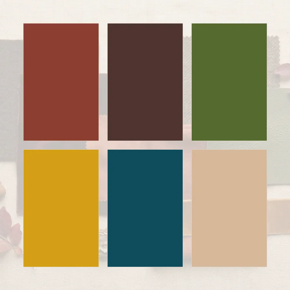
Rust#8B3E2FTops, dresses, knitwear
Olive Green#556B2FOuterwear, trousers, accessories
Burgundy#722F37Dresses, tops, winter coats
Mustard#D4A017Knitwear, scarves, accessories
Teal#0F4C5CTops, dresses, statement pieces
Chocolate Brown#4E342ETrousers, coats, bags
Warm Beige#D7B899Basics, knitwear, layering
Terracotta#B55236Tops, skirts, accessories

For a full 24-colour palette — neutrals, main colours, accents and metals — that you can save to your phone for shopping, use the palette generator.

Neutrals for Deep Autumn

Deep autumn’s neutrals are warm and deep: chocolate brown, espresso, warm charcoal, olive, camel and warm beige. Cream works better than stark white near the face, and a deep warm brown or charcoal often works better than pure black.

If black feels heavy near your face, try chocolate brown or espresso instead. They give the same depth with the warmth deep autumn needs.

See the best whites and neutrals for each undertone for the reasoning.

Best Colours to Wear

The strongest deep autumn colours sit near the face: rust, burgundy, teal, olive, deep forest green, warm plum and terracotta. Mustard and gold work beautifully as accents. For outfit combinations, see what goes with olive green and what goes with brown — both colours are at the heart of this palette.

Colours to Avoid

  • Icy pastels such as baby pink, powder blue and mint
  • Cool, bright jewel tones such as fuchsia and electric blue
  • Stark optic white near the face
  • Cool greys and silver-toned neutrals
  • Very light, washed-out shades that lack depth

You can still wear them away from the face — in trousers, shoes or a bag — if you love them.

Outfit Ideas

A rust knit with chocolate trousers and tan loafers. An olive jacket with a cream top, dark denim and brown ankle boots. A burgundy midi dress with a camel coat and brown boots. A teal blouse with warm beige trousers and a mustard scarf.

The colour combination generator can filter every combination to the deep autumn palette, and building a wardrobe from your colour palette explains the proportions.

Deep Autumn vs Other Seasons

Deep AutumnSoft AutumnTrue AutumnDeep Winter
TemperatureWarmWarm, mutedWarmCool
DepthDeepLight to mediumMediumDeep
IntensityRichSoft, greyedRich, earthyClear
Signature colourRustSagePumpkinBlack cherry

The most common confusion is with soft autumn, which is lighter and more muted, and with deep winter, which shares the depth but is cool rather than warm. The best colours for your season shows all twelve side by side.

The best colours for deep autumn are warm, rich and deep, with an earthy quality. They add warmth to the complexion and create a harmonious, polished look.

Metals, Hair and Beyond

Gold, bronze and copper sit naturally with deep autumn — see gold or silver for your undertone. Rich dark browns, chestnut and auburn suit deep autumn hair — see hair colour by colour season. When you shop, how to shop with a colour palette keeps you on track. Not sure you are warm? The undertone test is the place to start.

Frequently Asked Questions

What colours are in the deep autumn palette?

Warm, rich, deep colours: rust, olive green, burgundy, mustard, teal, chocolate brown, warm beige and terracotta.

How do I know if I am a deep autumn?

Warm undertones, darker hair and eyes, and looking best in rich, warm, deep colours rather than light or cool ones. The colour analysis quiz confirms it.

Can deep autumns wear black?

Away from the face, yes. Near the face, chocolate brown or espresso usually works better.

What is the difference between deep autumn and soft autumn?

Deep autumn is darker and richer; soft autumn is lighter and more muted, with greyed colours.

What metals suit deep autumn?

Gold, bronze and copper sit most naturally with deep autumn colouring.

For the colour theory behind palettes, see the Munsell colour system, and for the history of the seasonal approach, colour analysis.

The Best Colours for Your Season: All Twelve at a Glance

Colour analysis sorts people into four seasons and then twelve, and each has a palette of colours that works with that person’s natural colouring. This page lays out the best colours for your season side by side across all twelve — useful for comparing two seasons you are torn between, or for seeing where yours sits in the wider system.

It is an overview rather than the full palette. Each season below has its signature colours and a link to the complete guide. If you do not know your season yet, start with the quiz rather than here. More guides are in our Colour Analysis section.

Seasonal colour analysis is a styling convention, not a scientific system, and there is no peer-reviewed evidence behind it. It is useful as a way of narrowing a palette, and this site treats it that way.

Every palette below assumes you know your season. The quiz takes three minutes and needs no photo.

How the Twelve Seasons Work

The four families — spring, summer, autumn and winter — are defined by two things: whether your undertone is warm or cool, and whether your overall colouring is light or deep, clear or soft. Spring and autumn are warm; summer and winter are cool. Spring and summer are lighter; autumn and winter are deeper.

Each family then splits into three. Most people sit closer to one edge of their family than the middle, and the twelve-season system names that edge: light, true, bright, soft or deep. If you are unsure whether you are warm or cool at all, the undertone test is the place to start.

Undertone: the colour beneath the surface of the skin — warm, cool, neutral or olive. It stays the same when a tan comes and goes, which is why colour analysis is built on it.

The Best Colours for Each Season

Spring — Warm and Light

Light Spring

Pale, warm and delicate. Colours that look sunlit rather than bright. See the Light Spring palette.

SwatchNameHex
Peach#F4B393
Light Aqua#8FD3C8
Buttercream#F3E3A0

True Spring

Warm, clear and bright, with golden undertones throughout. See the True Spring palette.

SwatchNameHex
Coral#F26B4E
Warm Turquoise#1FB5A6
Golden Yellow#F2B33D

Bright Spring

Clear, warm and high contrast — the most saturated of the springs. See the Bright Spring palette.

SwatchNameHex
Poppy Red#E8413C
Bright Turquoise#00A6A6
Clear Yellow-Green#8CC63F

Summer — Cool and Soft

Light Summer

Pale, cool and gentle, with a slightly powdery quality. See the Light Summer palette.

SwatchNameHex
Powder Blue#A7C4DD
Soft Rose#E8B4BC
Lavender#C3B1D9

True Summer

Cool, soft and blended, with blue undertones throughout. See the True Summer palette.

SwatchNameHex
Soft Navy#3E4E6E
Raspberry#B04A6D
Blue-Grey#7E93A8

Soft Summer

Muted, cool and low contrast — colours with grey mixed in. See the Soft Summer palette.

SwatchNameHex
Mauve#A68499
Dusty Teal#5F8A8B
Soft Grey#9A9A9E

Autumn — Warm and Rich

Soft Autumn

Muted, warm and gentle — the quietest of the autumns. See the Soft Autumn palette.

SwatchNameHex
Sage#9CAF88
Camel#C19A6B
Dusty Coral#D08770

True Autumn

Warm, rich and earthy, with golden undertones. See the True Autumn palette.

SwatchNameHex
Pumpkin#D2691E
Olive#6B7A2F
Warm Gold#C9A227

Deep Autumn

Warm, dark and rich — the deepest of the autumns. Read the full Deep Autumn palette.

SwatchNameHex
Rust#8B3E2F
Burgundy#722F37
Olive Green#556B2F

Winter — Cool and Clear

Deep Winter

Dark, cool and high contrast. See the Deep Winter palette.

SwatchNameHex
Black Cherry#5A1F2E
Emerald#046A4A
Charcoal#2E2E33

True Winter

Cool, clear and vivid, with pure blue undertones. See the True Winter palette.

SwatchNameHex
True Red#C8102E
Royal Blue#1D4ED8
Pure White#FFFFFF

Bright Winter

Clear, cool and intense — the most striking of all twelve. See the Bright Winter palette.

SwatchNameHex
Fuchsia#D1127B
Icy Blue#BFE3F2
Cobalt#0047AB

When You Are Between Two Seasons

Neighbouring seasons share a lot of colours. A Soft Autumn and a Soft Summer both wear muted, greyed shades; a True Winter and a Bright Winter both wear clear, cool ones. If you are torn between two, the middle of both palettes is safe territory.

The difference shows at the extremes of each palette rather than the middle. Wear the shared colours first and pay attention to which edge you find yourself reaching for — the answer usually becomes obvious over a few weeks.

If you are torn between two seasons, wear the colours they share first. Those are safe either way, and the ones that clearly work better will become obvious over time.

From Season to Wardrobe

Three colours per season is a starting point, not a wardrobe. The palette generator turns your season into twenty-four swatches — neutrals, main colours, accents and metals — that you can shop with.

Then read building a wardrobe from your colour palette and how to shop with a colour palette. For putting colours together in an outfit, the outfit colour combination generator filters its combinations by season. And if you want the neutrals and metals that suit you, see the best whites and neutrals for each undertone and gold or silver for your undertone.

Frequently Asked Questions

What are the best colours for my season?

Each of the twelve seasons has its own palette, set by undertone and depth. The signature colours for all twelve are above, with a link to the full palette for each.

How do I find my colour season?

Take the colour analysis quiz, which uses your natural colouring to place you in one of the twelve seasons in about three minutes. Our guide on how to take a colour analysis quiz explains how to get an accurate result.

What if I am between two seasons?

Wear the colours the two seasons share. The difference between neighbouring seasons shows at the edges of each palette, not the middle.

Are the twelve seasons scientific?

No. Seasonal colour analysis is a styling convention with no peer-reviewed evidence behind it. It is a useful way to narrow a palette, not a measurement.

Can my colour season change?

Your underlying colouring changes little, but hair colour, a tan or greying hair can shift which colours work. See hair colour by colour season, and retake the quiz after any significant change.

For the colour theory underneath all of this, the Munsell colour system explains hue, value and chroma, and the history of colour analysis covers where the seasonal approach came from.

Capsule Wardrobe Over 40: Building It Around What Has Changed

Most advice about dressing after forty is a list of things to stop wearing. This is not that. Nothing about a capsule wardrobe changes on a birthday, and there is no hem length or colour that becomes wrong at a particular age. What does tend to change is useful: a much clearer sense of what you actually like, a body that may fit differently than it did ten years ago, and usually the means to buy fewer things of better quality.

Those three things make a capsule wardrobe over 40 easier to build than one at twenty-five, not harder. This guide is about using them. More guides like it are in our Style by Age section.

A capsule wardrobe over 40 follows the same rules as any other. The advantage is knowing your style, your fit and your colours well enough to stop buying things that do not work.

What Actually Changes, and Why It Helps

You Know Your Style

By now most people know what they reach for and what sits unworn. That knowledge is the most valuable input a capsule can have, because the hardest part of building one is resisting the aspirational purchase — the piece bought for a life you do not actually lead.

If you want to put a name to it, the personal style quiz gives you a dominant and a secondary style, which is more useful than a single word.

Fit Before Size

Bodies change, and a size that fit a decade ago may not fit now. Buying to current measurements rather than a remembered size is the single change that makes most wardrobes work again.

The clothing size converter works from your measurements, not a label, and the body shape calculator tells you where width sits on your frame today.

Fewer, Better

A capsule rewards spending more on fewer pieces, and cost per wear makes the case clearly. A coat worn most days for a decade costs very little per wear, even at a higher price.

Colour Can Shift

Greying hair, a change in hair colour or simply a different complexion can move which colours work best. A palette that suited you at thirty may need adjusting — not because of age, but because your colouring has changed.

This is one of the more useful things to check before building a capsule, because every piece in it is chosen to work with every other. Get the palette right and the rest follows.

If colours that used to work now look slightly off, your colouring may have shifted. Retaking the colour analysis quiz is worth doing after any significant change in hair colour.

Our guide to hair colour by colour season covers how a change in hair affects your palette, and building a wardrobe from your colour palette covers what to do with the result.

A Capsule Wardrobe Over 40, Piece by Piece

A capsule wardrobe laid flat: two coats, knits, a white shirt, a silk blouse, trousers, denim, a skirt, a dress, loafers, ankle boots, a bag and a scarf.

Outerwear

  • A wool coat that fits at the shoulder
  • A trench coat or light jacket

The two pieces seen most, and the two worth spending most on. See how to choose a trench coat.

Tops

  • Three fine knits in your base palette
  • A white shirt
  • Three quality t-shirts
  • One silk or silk-feel blouse

Enough to layer for most of the year without repeating an outfit too obviously.

Bottoms

  • Tailored trousers in a neutral
  • Straight-leg denim
  • One skirt

The bottoms are what everything else works around, so choose them first. How jeans should fit covers the checkpoints.

Dresses

  • One day dress
  • One dress that works for the evening

A day dress is the easiest complete outfit in the wardrobe.

Shoes

  • Leather flats or loafers
  • Ankle boots
  • One smarter pair

Walkable first, always. Read how French women buy shoes for the habits that make them last.

Accessories

  • One structured bag
  • One scarf in an accent colour

The scarf is where an accent colour does the most work for the least money.

Comfort in shoes matters more with every year of wearing uncomfortable ones. A shoe you cannot walk in for an afternoon does not belong in a capsule at any age.

Building It

Start with an audit, not a shop. Lay out the ten pieces you wear most — they already define your capsule, and they tell you which gaps are real. Then fill those gaps, starting with the coat and the trousers, because every other piece is chosen to work with them.

The builder asks about your climate and your week, not your age — because those are what decide the list.

Before buying anything expensive, run it through the cost per wear calculator, and read which pieces are worth spending on. For a fuller list across all four seasons, see the year-round capsule wardrobe checklist, and for the core pieces with the reasoning attached, the ten pieces European wardrobes are built on.

Frequently Asked Questions

What should be in a capsule wardrobe over 40?

The same core as any capsule — a good coat, tailored trousers, quality knits, denim, a versatile dress and comfortable shoes. The difference is choosing them with a clearer sense of your own style.

Is there anything I should stop wearing after 40?

No. There is no hem length, colour or style that becomes wrong at a particular age. Wear what fits your life and your taste.

How many pieces should a capsule wardrobe have?

Most work between thirty and forty pieces including shoes and outerwear. The builder adjusts the count to your climate and week.

Why do my clothes not fit the way they used to?

Bodies change shape over time, and sizing varies between brands anyway. Buying to current measurements rather than a remembered size fixes most of it.

Do my colours change as I get older?

Your colouring can shift, especially with greying or changed hair colour. If familiar colours look slightly off, retake the colour analysis quiz.

For background on the idea itself, see the history of the capsule wardrobe.